Data Analysis ,Student Performance Analytics.
Students Performance in Exams.
machine learning and data science
#import libraries
# data processing libraries
In [2]:
import pandas as pd
import numpy as np
import matplotlib.pyplot as plt
import seaborn as sns
In [3]:
download the data from kaggle link below https://www.kaggle.com/spscientist/students-performance-in-exams
now we read the csv file through panda.
df = pd.read_csv('../input/students-performance-in-exams/StudentsPerformance.csv')
df.head()
In [4]:
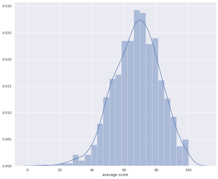
df['average score'] = df[['math score', 'reading score', 'writing score']].mean(axis=1)In [5]:
see the first five row through panda.
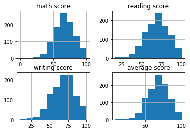
df.head()Lets plot a histogram!
In [6]:
df.hist()Out[6]
# here is histogram
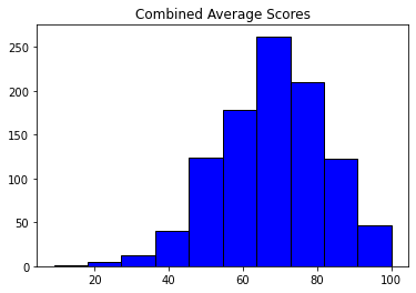
Execute the below code, in order to have a view for the histogram of the Average scores od students!
In [7]:
plt.hist(df['average score'], color = 'blue', edgecolor = 'black',bins=10)

# Add labels
plt.title('Combined Average Scores')
Out[7]:

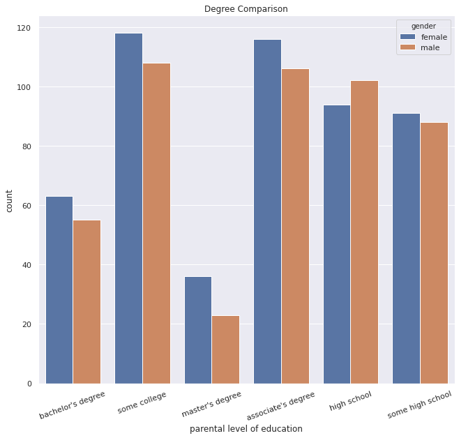
Now, We'll be executing below code to find the degree comparision based on the parental level of education data we have, with respect to the gender!
In [8]:
sns.set_style('whitegrid')
sns.set(rc={'figure.figsize':(10.7,9.7)})
sns.countplot(x = 'parental level of education', data = df, hue='gender')
plt.title('Degree Comparison')
locs, labels = plt.xticks()
plt.setp(labels, rotation=20)
Out[8]:

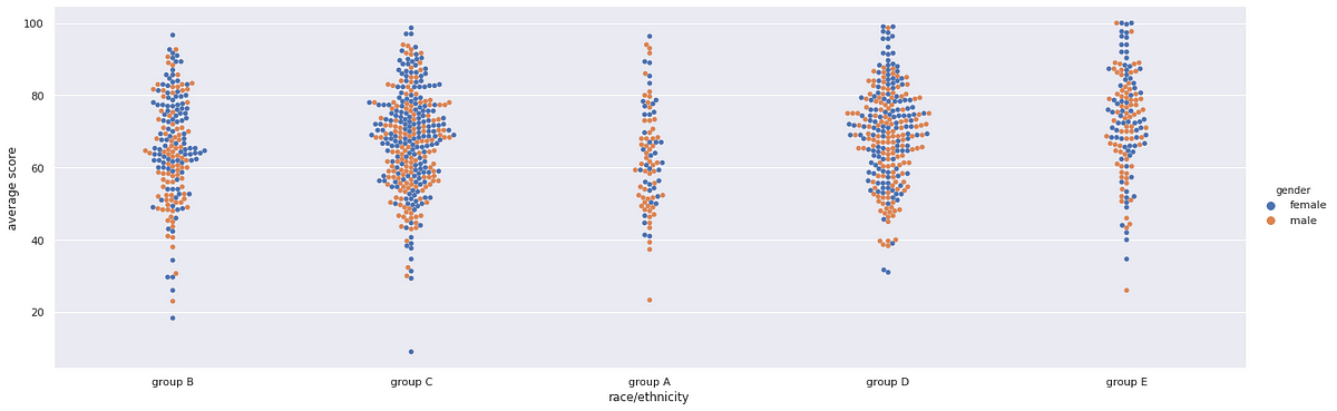
In [9]:
sns.catplot(x="race/ethnicity", y="average score", data=df,kind="swarm",hue='gender',height=6,aspect=3)Out[9]:
<seaborn.axisgrid.FacetGrid at 0x7fb3164b0350>
In [10]:
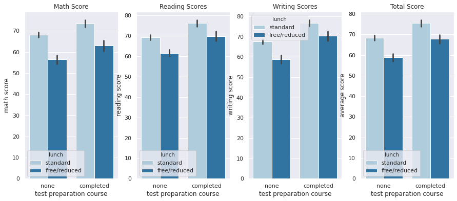
plt.figure(figsize=(15,6))
plt.subplot(1, 4, 1)
sns.barplot(x='test preparation course',y='math score',data=df,hue='lunch',palette='Paired')
plt.title('Math Score')
plt.subplot(1, 4, 2)
sns.barplot(x='test preparation course',y='reading score',data=df,hue='lunch',palette='Paired')
plt.title('Reading Scores')
plt.subplot(1, 4, 3)
sns.barplot(x='test preparation course',y='writing score',data=df,hue='lunch',palette='Paired')
plt.title('Writing Scores')
plt.subplot(1, 4,  4)
sns.barplot(x='test preparation course',y='average score',data=df,hue='lunch',palette='Paired')
plt.title('Total Score')
plt.show()
In [11]:
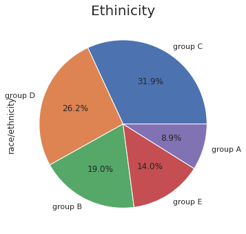
plt.figure(figsize=(30,20))
plt.subplots_adjust(left=0.125, bottom=0.1, right=0.9, top=0.9,
                      wspace=0.5, hspace=0.2)

plt.subplot(142)
plt.title('Ethinicity',fontsize = 20)
df['race/ethnicity'].value_counts().plot.pie(autopct="%1.1f%%")
Out[11]:
<matplotlib.axes._subplots.AxesSubplot at 0x7fb3167f4fd0>
In [12]:
#numerical columns
numerical_columns = ["math score", "reading score", "writing score", "average score"]
In [13]:
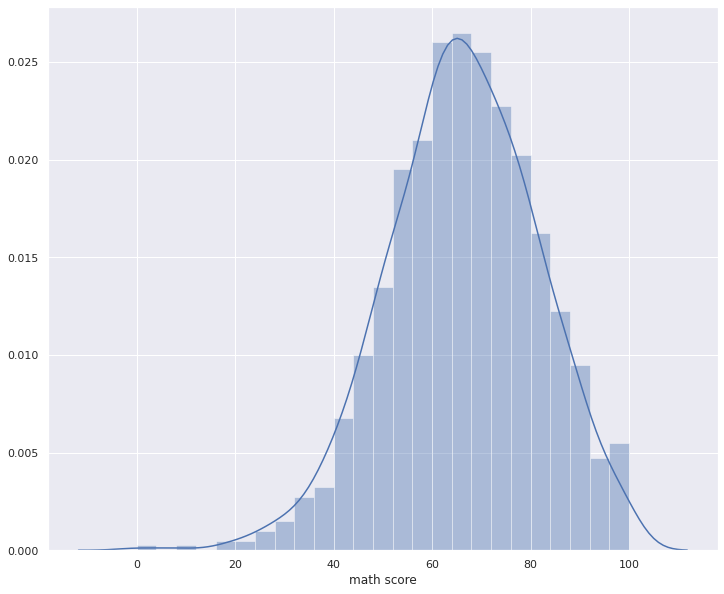
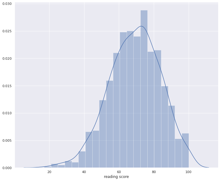
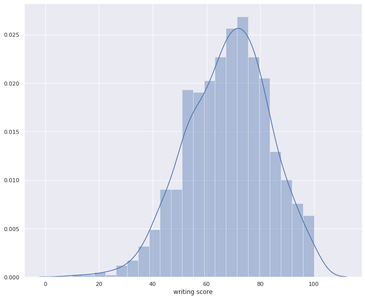
for i in numerical_columns:
    plt.figure(figsize=(12,10));
    sns.distplot(df[i])